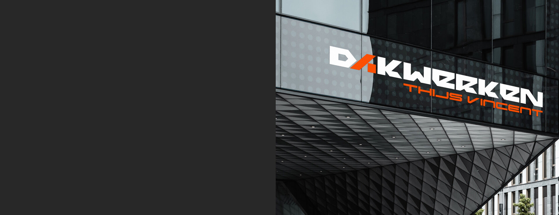
Dakwerken
A strong, geometric logo in a minimalist style, font without any rounding, raw. This is our logo design for Dakwerken. The letter A is characteristic, constructed at an angle, like a roof slope, it refers to the construction industry. Although the logo is quite long, we managed to professionally create a nice modern font that looks great.